Branding: The top 10 Rebrands of 2025
I tracked and reviewed more than 70 rebrands across 52 weeks, roughly 1.3 deep-dives every week, to identify what truly defined branding in 2025. The results are clear: bold brand worlds outperformed safe updates, emotional identities beat over-polished ones, tech-forward momentum brands dominated, and clarity punched harder than cleverness.
Now it’s your turn.
— Vote for your Top 3 rebrands on the LinkedIn carousel and help shape the final Top 10 Rebrands of 2025.
This list is the result of a year-long obsession with brands that punch. All year, I track rebrands as they happen. Not casually. Closely. Some weeks nothing lands. Other weeks, two or three strong identities drop at once.
Across 2025, that added up to around seventy rebrands worth paying attention to. From that long list came the Top 25. And from that, this final cut.
These are the Top 10 Rebrands of 2025. Chosen based on how strongly they connected over the year — through real engagement, conversation, and response.
They’re listed alphabetically. No ranking. Each one, in its own way, left a mark.
12
Base Design
(March 2025)
12 positions matcha as a daily ritual rather than a stimulant. Airbrushed textures, precise green accents and calm, architectural layouts create an identity that feels meditative and quietly luxurious. It avoids every cliché of the wellness category and instead builds a serene, intentional world that commands attention through restraint.
What Founders and Brand Owners Can Learn
Categories obsessed with noise create openings for brands that master quiet confidence.
Silence can be your loudest signal when your category is addicted to shouting. 12 proves that sophistication doesn’t come from embellishment but from discipline, a valuable reminder for any brand wanting to rise above trend fatigue.

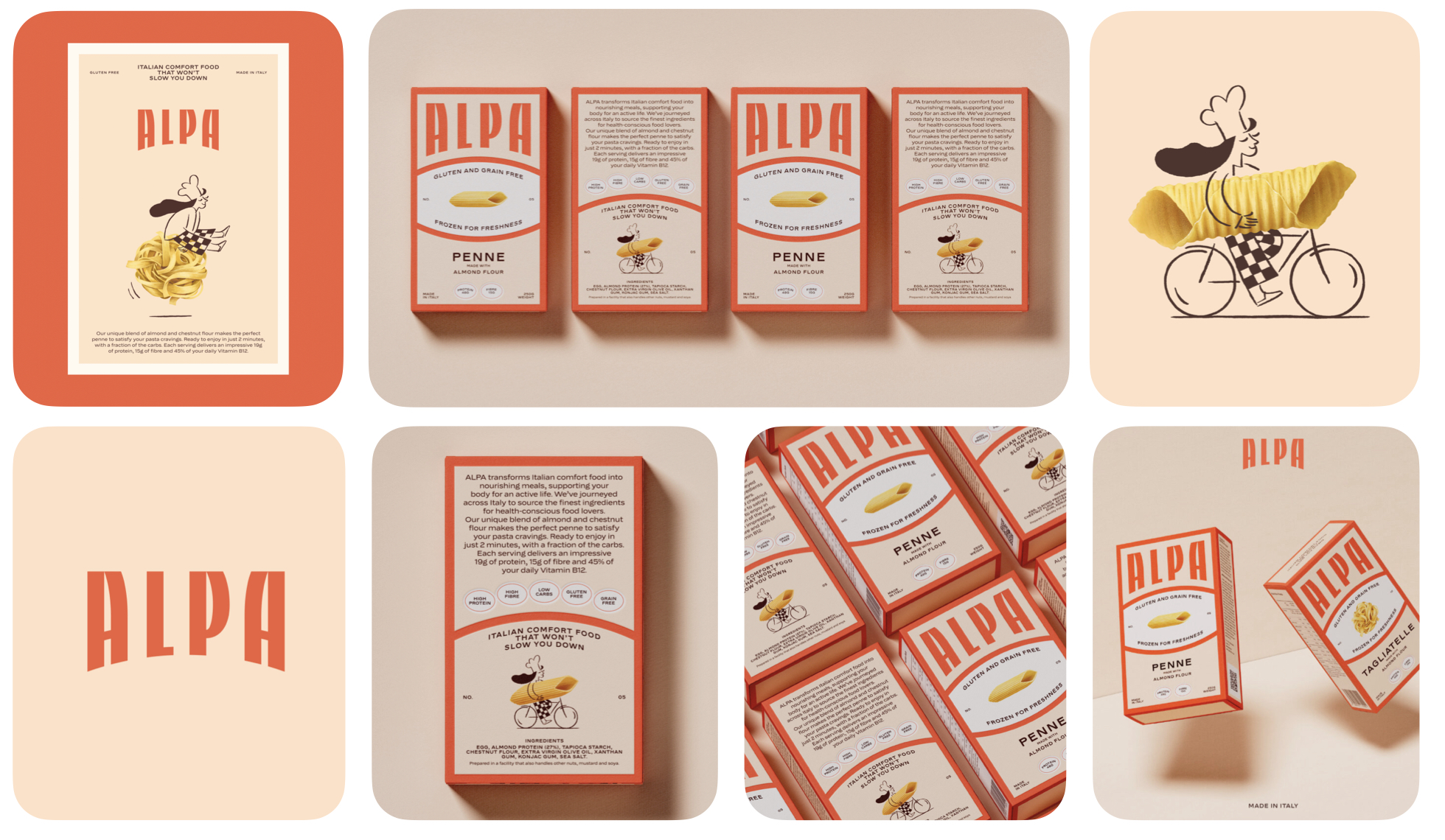
ALPA
Studio Tyrrell
(June 2025)
ALPA turns gluten-free pasta from a “compromise product” into a warm, comforting ritual. The refreshed identity leans into Italian heritage with bold typography, characterful illustrations and painterly almond motifs. Nothing here feels clinical or restrictive; instead, the system balances playfulness with discipline, giving the brand a cozy, elevated presence in a crowded wellness aisle.
What Founders and Brand Owners Can Learn
Most categories default to “functional messaging,” especially in health food. ALPA flips the script by focusing on joy instead of restriction.
If your product removes something, your brand must add something emotionally richer. By positioning gluten-free as a reward rather than a sacrifice, ALPA expands its appeal far beyond dietary needs. It becomes a brand people choose for taste, warmth and identity, not limitation.
Amazon
Koto + Amazon XCM
(May 2025)
Amazon’s first major refresh in two decades is all about coherence. The softened smile, clarified typography and reorganized color system bring order to one of the world’s widest ecosystems. Sub-brands now feel related without becoming identical, creating a flexible architecture that finally pulls a thousand services into a single recognizable world.
What Founders and Brand Owners Can Learn
Amazon proves that scale collapses without structure. A brand doesn’t grow by adding elements, it grows by aligning them.
When your system becomes clearer, your customer journey becomes faster. This evolution shows that clarity is not cosmetic; it’s operational. A clean system accelerates product teams, strengthens recognition and turns coherence into a competitive advantage.

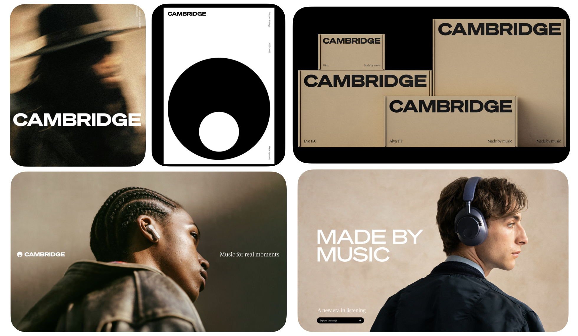
Cambridge Audio
Only Studio
(June 2024)
Cambridge Audio shifts from engineering-first to emotion-first. The liberated marque, refreshed typography and lighter digital presence reconnect the brand to the human side of sound. It stops speaking in specs and starts speaking in culture, celebrating music as an experience rather than a technical achievement.
What Founders and Brand Owners Can Learn
Legacy brands often get trapped in their own expertise. Cambridge Audio breaks free by returning to the feeling that started it all: love for music.
If your brand has lost touch with its original emotion, your audience likely has too. The move proves that reconnecting with your core purpose can unlock relevance and modern appeal, even in highly technical categories.
Enky
Nemesis Studio
(March 2025)
Enky reframes circular furniture from a moral obligation into an aspirational choice. The identity swaps guilt-coded sustainability cues for bold typography, confident geometry and a crisp, modern layout system. Instead of lecturing, the brand now signals intelligence, style and global relevance. It feels less like a used-goods platform and more like an elevated, design-forward lifestyle choice.
What Founders and Brand Owners Can Learn
Sustainability doesn’t scale when it’s framed as sacrifice. Enky succeeds because it makes reuse desirable rather than dutiful.
If you want behaviour change, upgrade the desire, not the messaging. By elevating circular furniture into a smarter, more stylish default, Enky shows that design can drive adoption faster than education alone. It stops asking consumers to compromise and instead invites them to feel proud of the choice.

Every brand on this list made one decision that changed everything. Not a bigger budget. Not a bolder designer. A clearer answer to the question — what does this brand actually stand for, and who is it genuinely for?
If you don't have a clear answer to that yet, that's the conversation a Vision Clarity Session is built for.
Book a Free Vision Clarity Session →
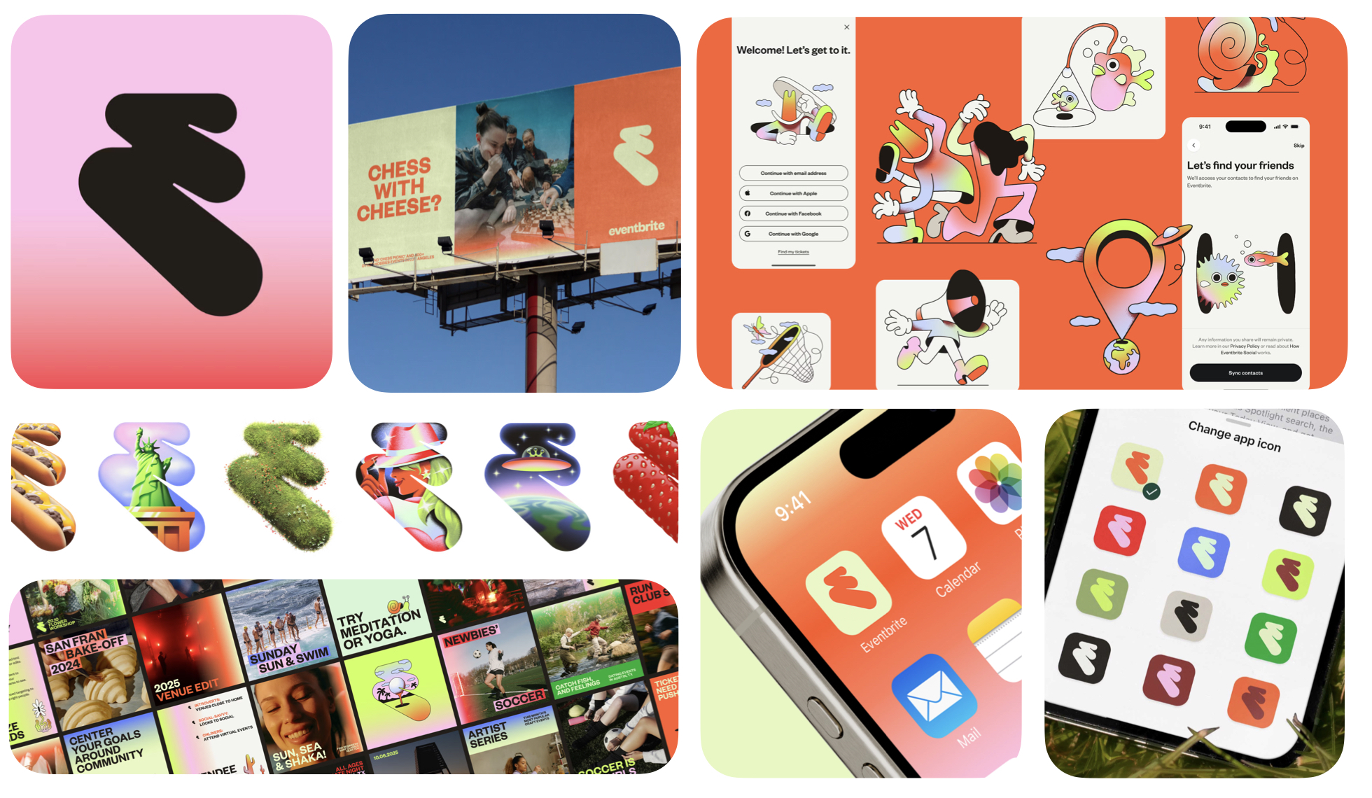
Eventbrite
Buck
(March 2025)
Eventbrite’s rebrand shifts the platform from a simple checkout tool to an energetic cultural catalyst. The new Path monogram, expressive colour system and character-rich illustrations inject motion, discovery and anticipation into every touchpoint. It finally reflects what the brand truly fuels, the spark before the moment, not just the transaction that gets you there.
What Founders and Brand Owners Can Learn
Most digital platforms brand themselves around the end of the journey. Eventbrite wins by owning the beginning, the excitement, the planning and the emotional lift that comes before the event itself.
If your product is part of a bigger moment, brand the momentum, not the mechanism. By shifting from utility to energy, Eventbrite expands its role in people’s lives and positions itself as a cultural instigator rather than a passive facilitator.
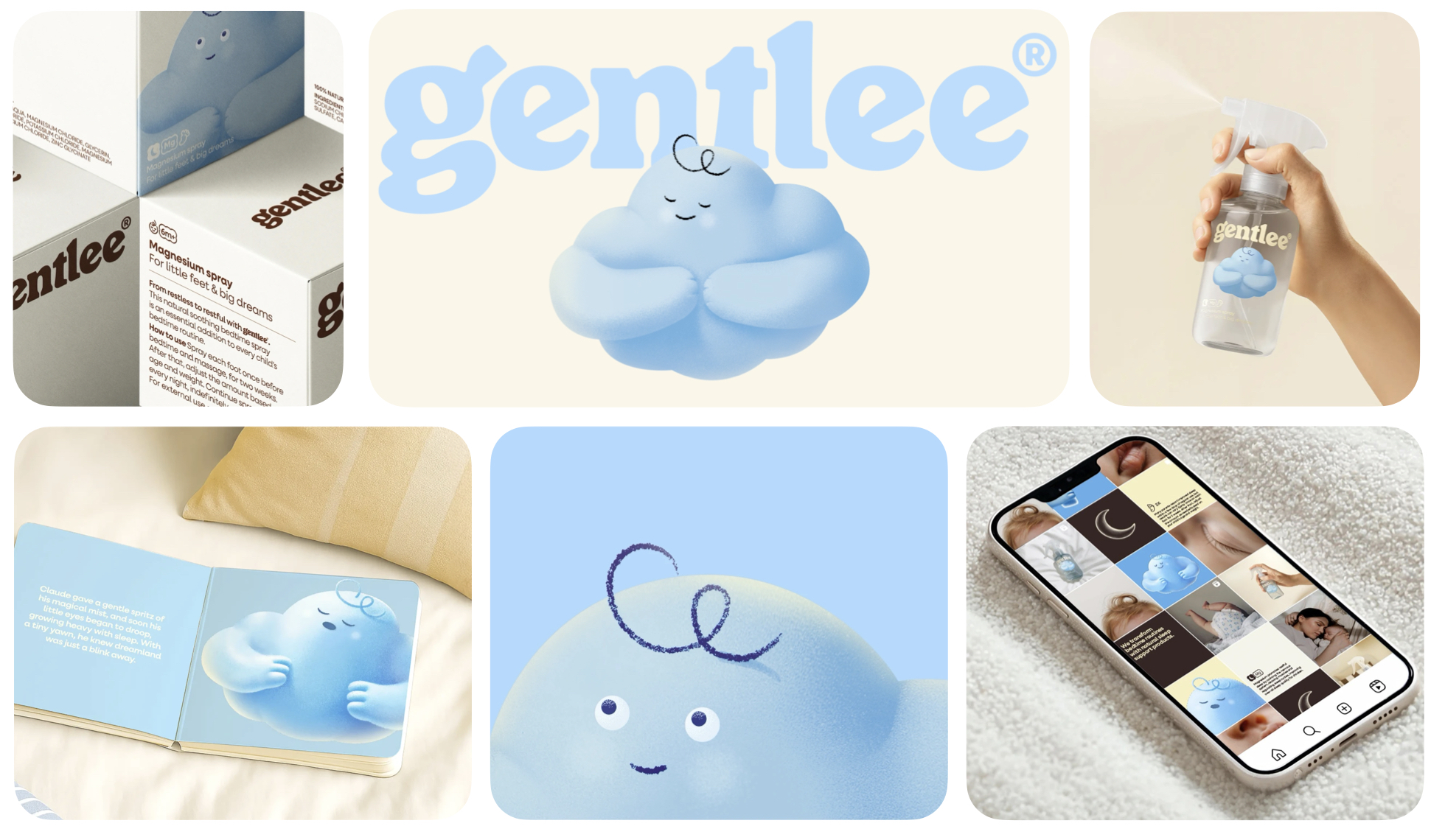
Gentlee
WeWantMore
(June 2025)
Gentlee transforms sleep wellness into a gentle, family-centered ritual. With its cloud mascot, soft textures and pale, reassuring palette, the brand balances imagination for children with clarity and trust for parents. It feels soothing without becoming clinical, and playful without losing credibility, anchoring both audiences in a shared promise of calmer nights and happier days.
What Founders and Brand Owners Can Learn
Brands that serve families often struggle to speak to parents and children at the same time. Gentlee solves this by building an emotional bridge: comfort for kids, confidence for parents.
If you serve two audiences, design your brand so each sees their own reassurance in it. This dual-focus approach turns a simple magnesium spray into something more valuable, a nightly ritual that builds connection, consistency and long-term loyalty.
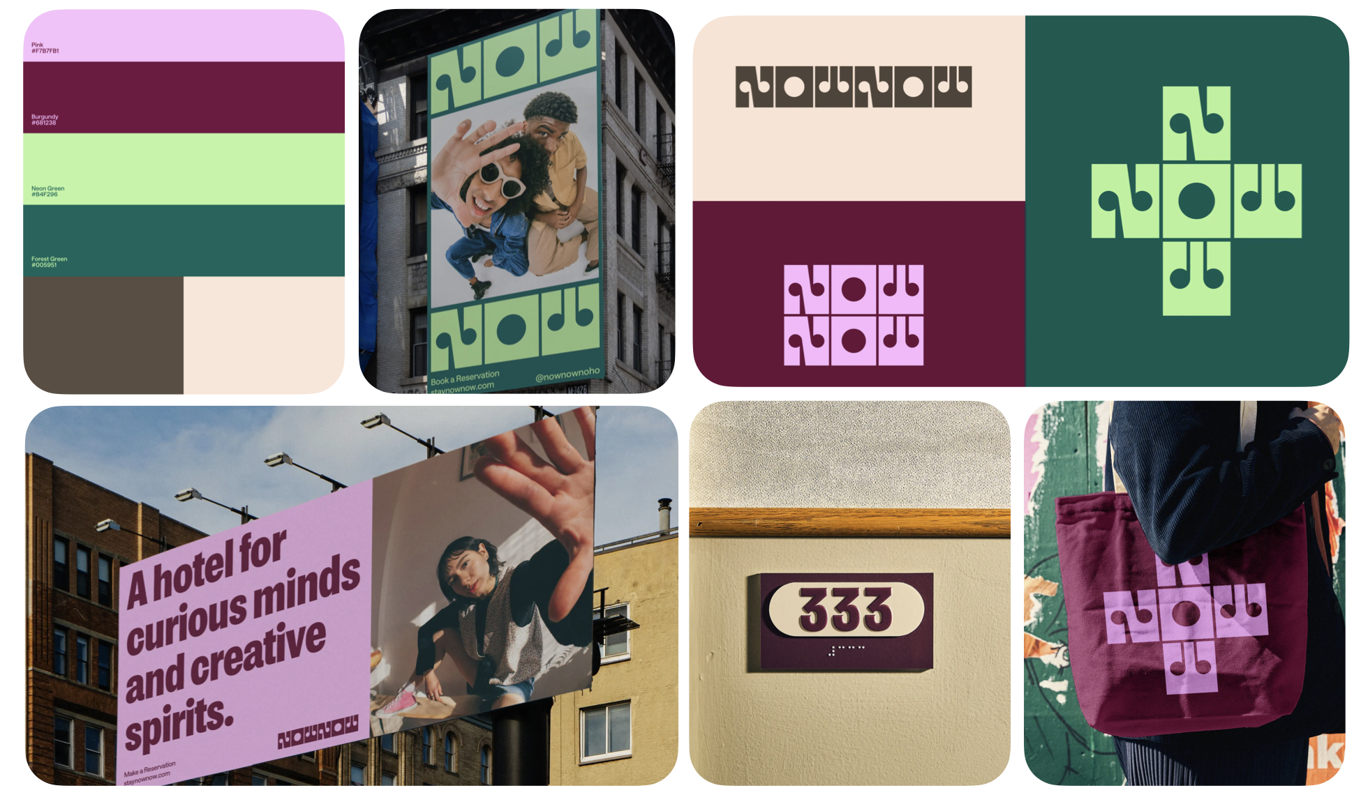
18. Now Now
Saint Urbain
(May 2024)
Now Now turns impatience into brand personality. The stacked wordmark, warm tones and punchy, shareable layouts capture a fast, playful energy that stands apart from the overly serious boutique hotel space. It’s charming, direct and instantly memorable, a brand built for the momentum-driven mindset of modern travelers.
What Founders and Brand Owners Can Learn
Every brand has a truth. Few dare to turn that truth into identity. Now Now builds its entire personality around a human behaviour most brands ignore.
Own the impulse behind your product — not just the product itself. By embracing immediacy, the brand becomes refreshingly distinctive in a category addicted to slow, poetic storytelling.
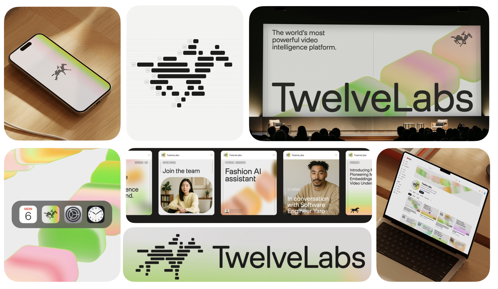
23. Twelve Labs
Pentagram
(May 2024)
Twelve Labs visualizes intelligence through motion. Pentagram’s thread diagrams map how AI reads sight, sound, text and movement, while the galloping horse nods to the roots of motion study. The system feels foundational yet expressive, translating invisible AI processes into something people can intuitively grasp.
What Founders and Brand Owners Can Learn
AI brands often lean too heavily on abstraction or futurism. Twelve Labs wins by making complexity beautifully human.
If people can’t see how your tech works, show them how it feels. The identity brings dimensional clarity to an industry full of ambiguity — a powerful strategic advantage.
Walmart
JKR
(January 2025)
Walmart’s evolution is subtle but meaningful. The refined wordmark, richer True Blue and sharper Spark create a more confident, omni-channel identity that flexes across clinics, delivery vans, signage and digital environments. It’s a refresh built on precision — small changes that add up to a major impact.
What Founders and Brand Owners Can Learn
Not every rebrand needs theatrics. Walmart proves the power of incremental clarity.
Small refinements, repeated consistently, can shift the perception of an entire brand. By modernizing without overhauling, Walmart strengthens familiarity while improving usability — a smart balance for any high-frequency brand.

After a year of tracking, analysing and reshaping this long list into something meaningful, one thing is clear: great rebrands don’t happen by chance. They happen when brands choose clarity over noise, courage over comfort and discipline over decoration. The 10 brands on this list didn’t simply change how they look they sharpened how they compete, how they behave and how they show up in culture.
If you’re a founder or brand owner, this list is more than inspiration. It’s a roadmap. Every one of these rebrands, in its own way, proves that design is not cosmetic. It’s strategic. It shapes perception, guides behaviour and directly influences growth.
The brands that win are the ones willing to rethink themselves before the market forces them to. The ones that evolve with intention, not panic. The ones that choose to stand out, not blend in.
This year’s Top 10 shows what happens when brands commit to that level of clarity and ambition. Now it’s your turn to decide which of them truly defined 2025.
→ Download as PDF
If this article made you think about your own brand, that's worth a conversation.
Book a Free Vision Clarity Session →


