Branding: The top 25 Rebrands of 2025
I tracked and reviewed more than 70 rebrands across 52 weeks, roughly 1.3 deep-dives every week, to identify what truly defined branding in 2025. The results are clear: bold brand worlds outperformed safe updates, emotional identities beat over-polished ones, tech-forward momentum brands dominated, and clarity punched harder than cleverness.
Now it’s your turn.
— Vote for your Top 3 rebrands on the LinkedIn carousel and help shape the final Top 10 Rebrands of 2025.
A year long hunt for brands that punch. Every year I study hundreds of rebrands. Not casually. Obsessively. Across twelve months I track every shift, refresh and full scale rethink that brands launch into the world. Some weeks there is nothing new. Other weeks three brilliant identities drop at once. Over 2025 that added up to around seventy strong contenders for this list.
From that long list comes this one. The Top 25 Rebrands of 2025. Some are quiet, system led evolutions. Some reframe entire categories. A few trigger full blown culture debates. Now I am handing the final decision to you.
Your votes will help crown the 'Top 10 Rebrands of 2025'. This sits on top of another signal I track all year long. Your likes, comments and reposts on LinkedIn. Together they show which brands really connected.
How this works
1. All year on LinkedIn
Almost every Tuesday I highlight a new rebrand on my LinkedIn. Some weeks there’s one. Some weeks two or three. Over time this builds a running radar of the most interesting brand moves of the year.
If you want each drop in real time, follow me on LinkedIn.
2. Social engagement builds the long list
Your likes, comments and reposts help me track what resonates. That engagement quietly shapes a long list of standout rebrands. The list stays private until December.
3. December reveal of the Top 25
In December I publish the Top 25 Rebrands of 2025 in alphabetical order.
If you’re reading this article, you’re looking at that list.
4. THE VOTES ARE IN
Over December and January, readers voted for their Top 3. The engagement across LinkedIn and the site shaped the final ranking.
5. THE TOP 10 HAS BEEN CROWNED
The final Top 10 Rebrands of 2025 have been chosen, a combination of reader votes and year-long social signals.
See the Top 10 Rebrands of 2025 →
And now, the moment we wait all year for. Here’s the list. Let’s go.
1. Adobe
Mother Design + Adobe In-house
(May 2025)
Adobe’s 2025 refresh brings its entire ecosystem back into alignment. A tighter grid, the Adobe Lens device and a cleaner red system create a brand that finally feels unified and intentional. It’s not loud. It’s controlled, modern and unmistakably authored, the kind of rebrand that strengthens a giant without overshadowing the creators it serves.
What Founders and Brand Owners Can Learn
For founders, the lesson is simple: when your brand feels scattered, your product looks smaller than your ambition. Adobe didn’t redesign to look “more creative.” It rebuilt the system behind its creativity.
System beats style. Clarity is what earns trust at scale. By choosing discipline over decoration, Adobe now frames the work instead of competing with it, a quiet confidence move that makes the whole brand feel stronger.

2. Aires
August
(April 2025)
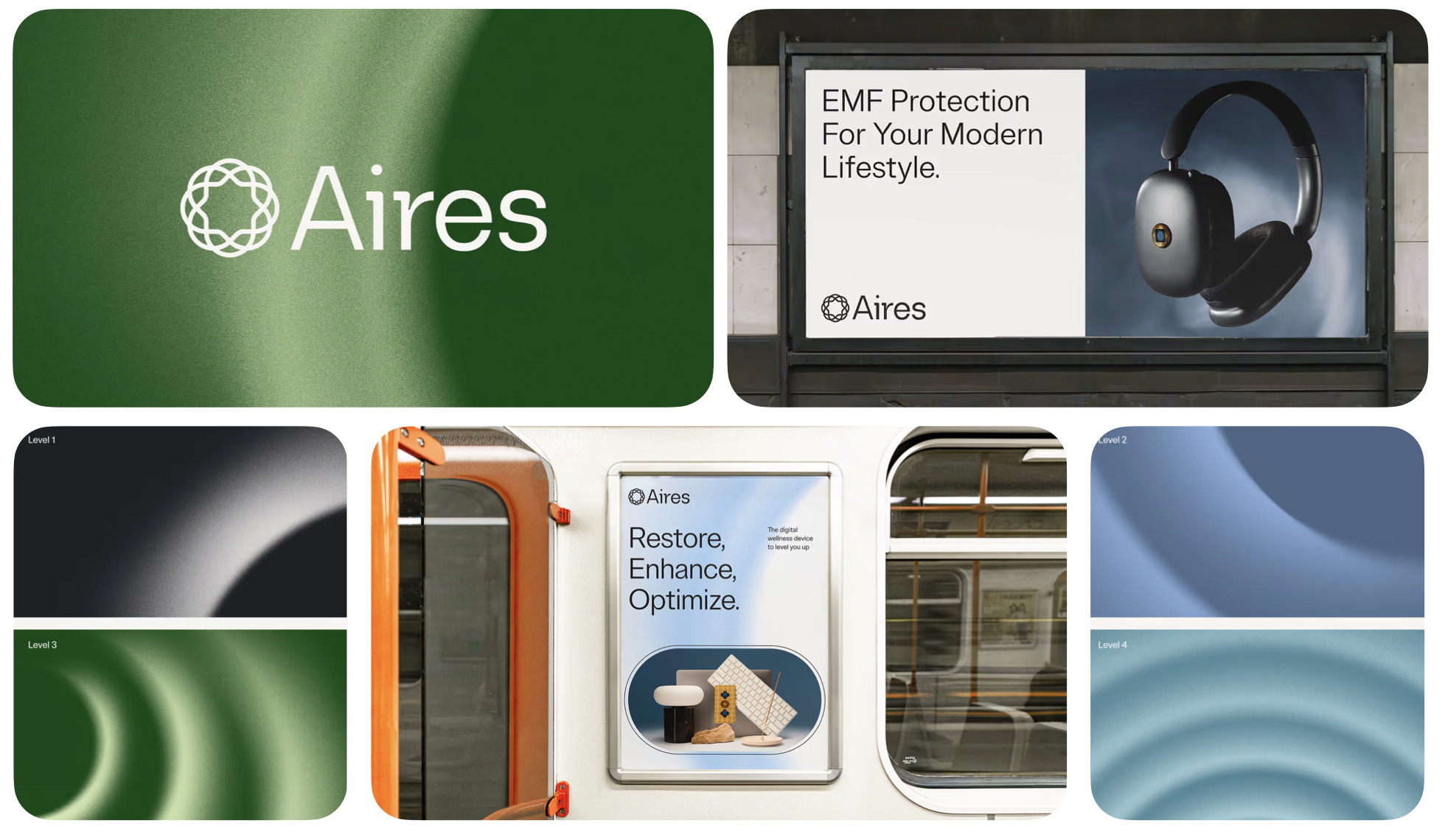
Aires’ shift from EMF tech to everyday digital wellness is a smart repositioning. The softened symbol, calmer gradients and refined typography replace anxiety with reassurance. The brand now feels accessible, credible and far more human, turning a niche concern into a mainstream wellbeing story.
The founder lesson is clear: when your category feels complex, emotional clarity expands your audience faster than technical detail ever will.
If your product is complicated, simplify the feeling, not the science. Aires wins because it stops explaining the problem and starts expressing the benefit, making digital wellness feel comforting instead of intimidating.
3. ALPA
Studio Tyrrell
(June 2025)
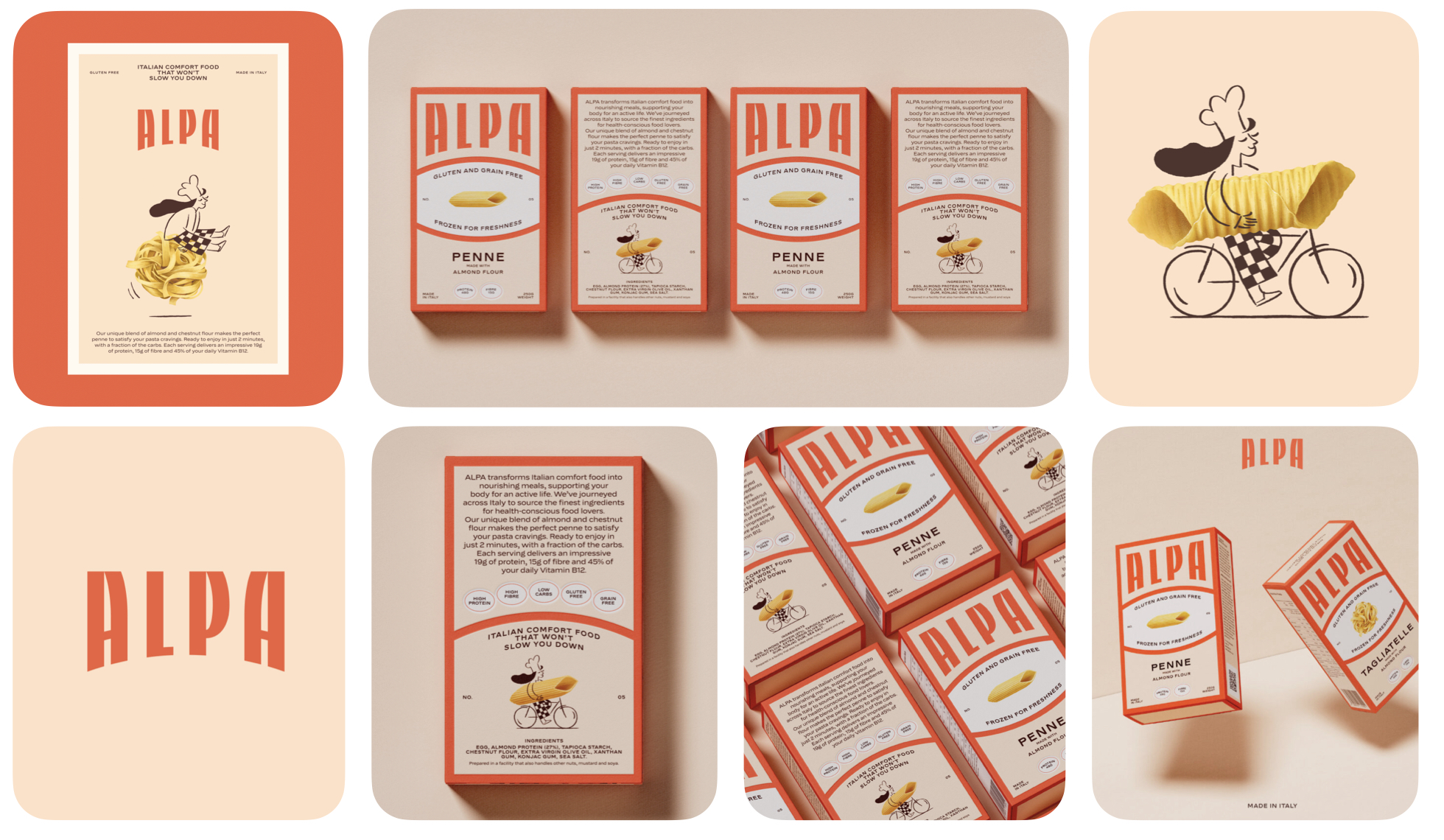
ALPA turns gluten-free pasta from a “compromise product” into a warm, comforting ritual. The refreshed identity leans into Italian heritage with bold typography, characterful illustrations and painterly almond motifs. Nothing here feels clinical or restrictive; instead, the system balances playfulness with discipline, giving the brand a cozy, elevated presence in a crowded wellness aisle.
What Founders and Brand Owners Can Learn
Most categories default to “functional messaging,” especially in health food. ALPA flips the script by focusing on joy instead of restriction.
If your product removes something, your brand must add something emotionally richer. By positioning gluten-free as a reward rather than a sacrifice, ALPA expands its appeal far beyond dietary needs. It becomes a brand people choose for taste, warmth and identity, not limitation.
4. Amazon
Koto + Amazon XCM
(May 2025)
Amazon’s first major refresh in two decades is all about coherence. The softened smile, clarified typography and reorganized color system bring order to one of the world’s widest ecosystems. Sub-brands now feel related without becoming identical, creating a flexible architecture that finally pulls a thousand services into a single recognizable world.
What Founders and Brand Owners Can Learn
Amazon proves that scale collapses without structure. A brand doesn’t grow by adding elements, it grows by aligning them.
When your system becomes clearer, your customer journey becomes faster. This evolution shows that clarity is not cosmetic; it’s operational. A clean system accelerates product teams, strengthens recognition and turns coherence into a competitive advantage.

5. Cambridge Audio
Only Studio
(June 2024)
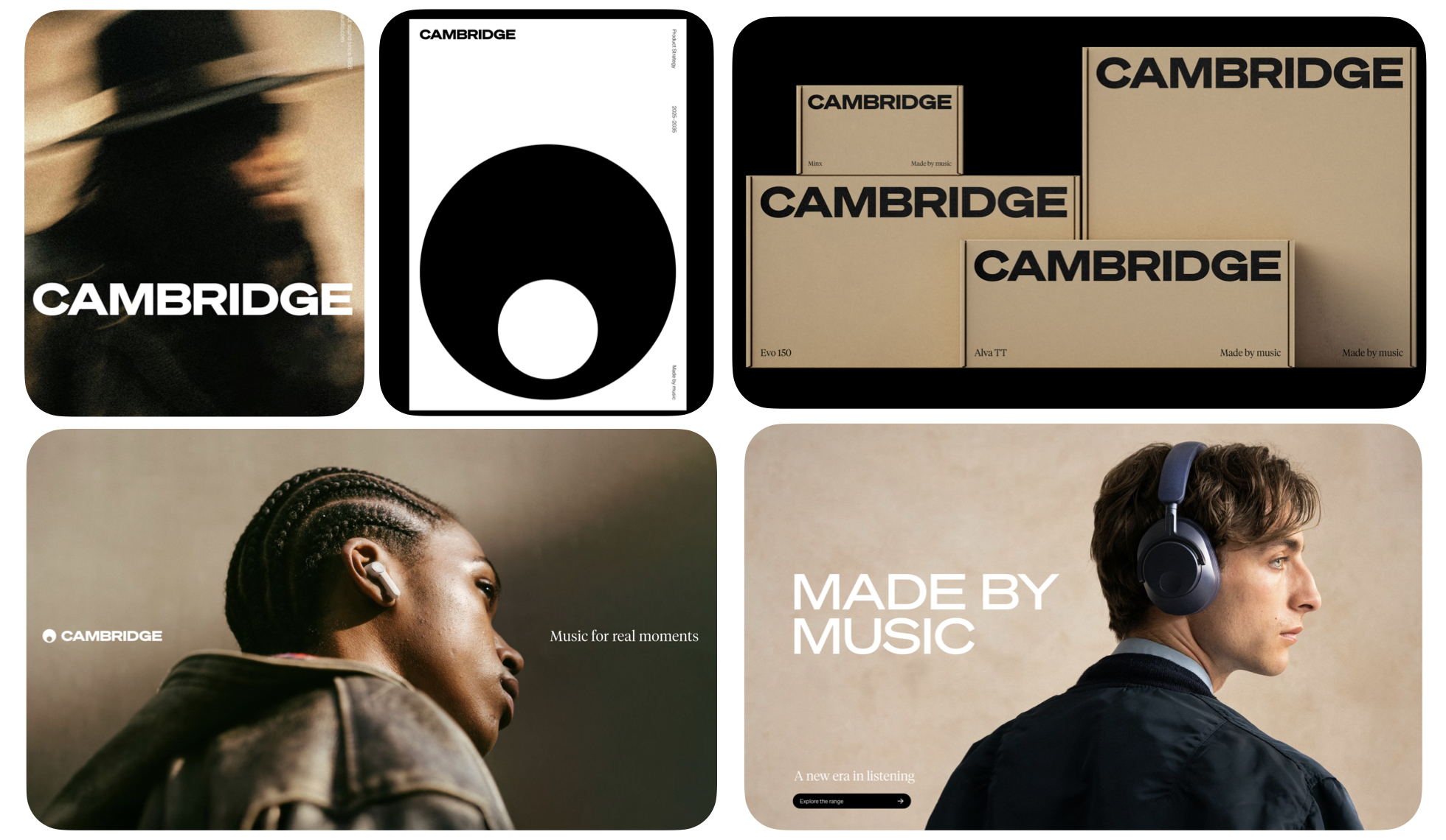
Cambridge Audio shifts from engineering-first to emotion-first. The liberated marque, refreshed typography and lighter digital presence reconnect the brand to the human side of sound. It stops speaking in specs and starts speaking in culture, celebrating music as an experience rather than a technical achievement.
What Founders and Brand Owners Can Learn
Legacy brands often get trapped in their own expertise. Cambridge Audio breaks free by returning to the feeling that started it all: love for music.
If your brand has lost touch with its original emotion, your audience likely has too. The move proves that reconnecting with your core purpose can unlock relevance and modern appeal, even in highly technical categories.
6. Colgate-Palmolive
Design Bridge and Partners
(August 2025)
Colgate-Palmolive’s refreshed monogram introduces a subtle smile in the negative space and a brighter blue across its global portfolio. The system feels cleaner, more unified and more digital-first, shifting the company from distant corporate entity to a recognizable, human-centered master brand.
What Founders and Brand Owners Can Learn
Large organizations frequently lose coherence as they grow. This rebrand shows the power of tightening the center before expanding the edges.
Consistency compounds trust, especially at scale. The visual refinements are not flashy, but they create a stable foundation that anchors hundreds of product lines with shared meaning.

7. Cracker Barrel
In-house + Agency Partners
(September 2025)
Cracker Barrel made headlines not for its visuals but for the cultural tension around them. Removing the seated figure and elevating the barrel sharpens the identity and moves the brand away from limiting nostalgia. Typography and layout modernize the retail experience without severing heritage, a delicate but necessary evolution for relevance.
What Founders and Brand Owners Can Learn
Rebrands live in culture, not in strategy decks. Even well-crafted identities can face backlash when they challenge long-held expectations.
If people react strongly, it means the brand still matter, silence is the real danger. Cracker Barrel’s update reminds leaders that progress sometimes requires discomfort, and that shaping the future may demand letting go of old symbols.

8. Enky
Nemesis Studio
(March 2025)
Enky reframes circular furniture from a moral obligation into an aspirational choice. The identity swaps guilt-coded sustainability cues for bold typography, confident geometry and a crisp, modern layout system. Instead of lecturing, the brand now signals intelligence, style and global relevance. It feels less like a used-goods platform and more like an elevated, design-forward lifestyle choice.
What Founders and Brand Owners Can Learn
Sustainability doesn’t scale when it’s framed as sacrifice. Enky succeeds because it makes reuse desirable rather than dutiful.
If you want behaviour change, upgrade the desire, not the messaging. By elevating circular furniture into a smarter, more stylish default, Enky shows that design can drive adoption faster than education alone. It stops asking consumers to compromise and instead invites them to feel proud of the choice.

Enky rebrand: Second Hand, First Choice
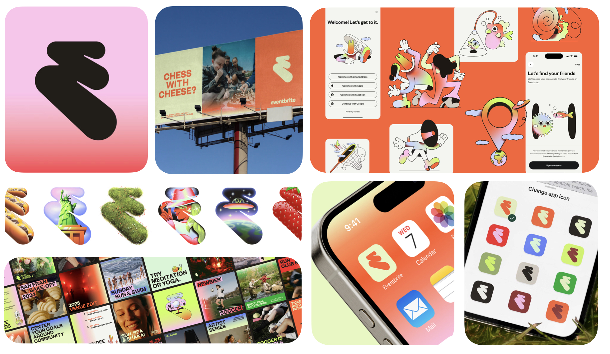
9. Eventbrite
Buck
(March 2025)
Eventbrite’s rebrand shifts the platform from a simple checkout tool to an energetic cultural catalyst. The new Path monogram, expressive colour system and character-rich illustrations inject motion, discovery and anticipation into every touchpoint. It finally reflects what the brand truly fuels, the spark before the moment, not just the transaction that gets you there.
What Founders and Brand Owners Can Learn
Most digital platforms brand themselves around the end of the journey. Eventbrite wins by owning the beginning, the excitement, the planning and the emotional lift that comes before the event itself.
If your product is part of a bigger moment, brand the momentum, not the mechanism. By shifting from utility to energy, Eventbrite expands its role in people’s lives and positions itself as a cultural instigator rather than a passive facilitator.
10. Gentlee
WeWantMore
(June 2025)
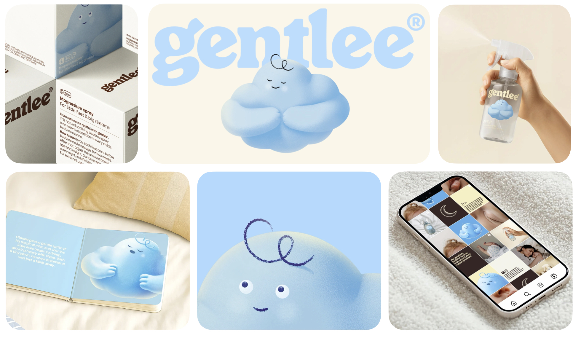
Gentlee transforms sleep wellness into a gentle, family-centered ritual. With its cloud mascot, soft textures and pale, reassuring palette, the brand balances imagination for children with clarity and trust for parents. It feels soothing without becoming clinical, and playful without losing credibility, anchoring both audiences in a shared promise of calmer nights and happier days.
What Founders and Brand Owners Can Learn
Brands that serve families often struggle to speak to parents and children at the same time. Gentlee solves this by building an emotional bridge: comfort for kids, confidence for parents.
If you serve two audiences, design your brand so each sees their own reassurance in it. This dual-focus approach turns a simple magnesium spray into something more valuable, a nightly ritual that builds connection, consistency and long-term loyalty.
11. The Hartford
Pentagram
(February 2025)
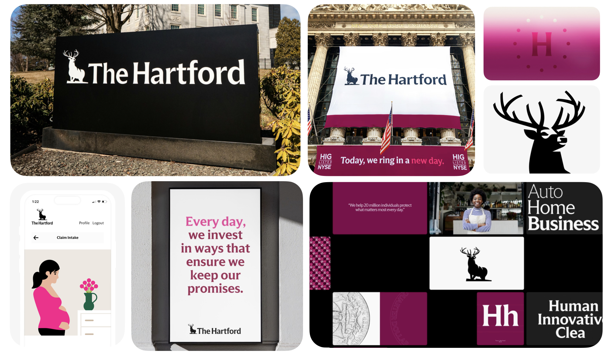
The Hartford’s rebrand sharpens a 200-year-old icon without stripping away its heritage. Pentagram refines the stag, introduces a confident Claret palette and pairs it with typography inspired by coins and classic serif authority. The result is steady, modern and unmistakably rooted in legacy, a brand that feels forward-looking while still carrying the weight of everything it has earned.
What Founders and Brand Owners Can Learn
Heritage is an asset only when it’s focused, not frozen. The Hartford succeeds by clarifying what should stay, what should evolve and what should disappear.
Don’t modernize your history, modernize how clearly it’s expressed. This rebrand proves that maturity doesn’t require loud change, just disciplined refinement that strengthens what people already trust.
12. Kellogg’s
Landor
(March 2025)
Kellogg’s “Seed Your Day” rebrand pulls the company back into the emotional heart of breakfast. The cropped wordmark, vibrant colour system and refreshed characters turn morning routines into a cultural moment rather than a product choice. It’s warm, energetic and rooted in daily identity, a reminder that breakfast is rhythm, comfort and the emotional start to the day.
What Founders and Brand Owners Can Learn
When brands drift from everyday relevance, the fix isn’t nostalgia, it’s reconnecting to the ritual they once owned.
If your brand is part of a daily habit, build around the emotion, not the SKU. Kellogg’s shows that you win mornings not by selling cereal, but by understanding what mornings mean to people.

You've just read 12 rebrand breakdowns.
Every single one came down to the same moment — leadership deciding they were ready to be honest about what their brand actually was, versus what they wanted it to be.
That's the conversation we have in a Vision Clarity Session. 60 minutes. No fluff. A clear picture of where your brand stands before we decide where it needs to go.
Book a Free Vision Clarity Session →
13. Khloud
Turner Duckworth
(April 2025)
Khloud breaks the sterile trap of wellness branding by injecting joy, fashion energy and cultural playfulness into a protein snack brand. Sky-blue tones, joyful illustrations and bold packaging transform health from something you tolerate into something you proudly carry. It feels expressive, optimistic and far more lifestyle-driven than typical nutrition brands.
What Founders and Brand Owners Can Learn
Wellness often defaults to seriousness, but today’s consumers want vitality, not purity. Khloud wins by turning health into a feeling people enjoy, not a discipline they endure.
If you want people to adopt a healthy choice, make it feel aspirational, not sacrificial. This shift reframes wellness as identity and builds a brand people want to be seen with.

14. KNSK
Hyperfocus
(September 2025)
KNSK’s rebrand brings discipline and creative edge into one clear frame. The Lumi symbol, dual-typography system and motion logic create an identity that feels sharp, intentional and culturally aware. It’s a brand that communicates order without rigidity and creativity without chaos, a rare equilibrium for a creative agency.
What Founders and Brand Owners Can Learn
Agencies often overstyle their own identities, but KNSK proves that restraint can signal deeper alignment.
Creativity becomes more powerful when it sits on top of structure, not noise. By embracing precision, the agency positions itself as a leader that thinks clearly and moves decisively.

15. La-Z-Boy
Colle McVoy
(July 2025)
La-Z-Boy reframes comfort as a modern lifestyle signal rather than a guilty pleasure. The retro-inspired script wordmark, softer palette and inviting visual system reflect a culture where rest is now a premium state. It feels warm, confident and emotionally relevant, a furniture brand that understands the cultural shift toward slowing down.
What Founders and Brand Owners Can Learn
Comfort isn’t the absence of effort, it’s the presence of care. La-Z-Boy taps into a real cultural moment by elevating rest from indulgence to identity.
If the culture shifts, redefine your product through that new emotional lens. By aligning with the rise of burnout and the desire for meaningful downtime, the brand steps into far bigger territory than furniture.

16. 12
Base Design
(March 2025)
12 positions matcha as a daily ritual rather than a stimulant. Airbrushed textures, precise green accents and calm, architectural layouts create an identity that feels meditative and quietly luxurious. It avoids every cliché of the wellness category and instead builds a serene, intentional world that commands attention through restraint.
What Founders and Brand Owners Can Learn
Categories obsessed with noise create openings for brands that master quiet confidence.
Silence can be your loudest signal when your category is addicted to shouting. 12 proves that sophistication doesn’t come from embellishment but from discipline, a valuable reminder for any brand wanting to rise above trend fatigue.

17. Nike
Kurppa Hosk + Nike
(July 2025)
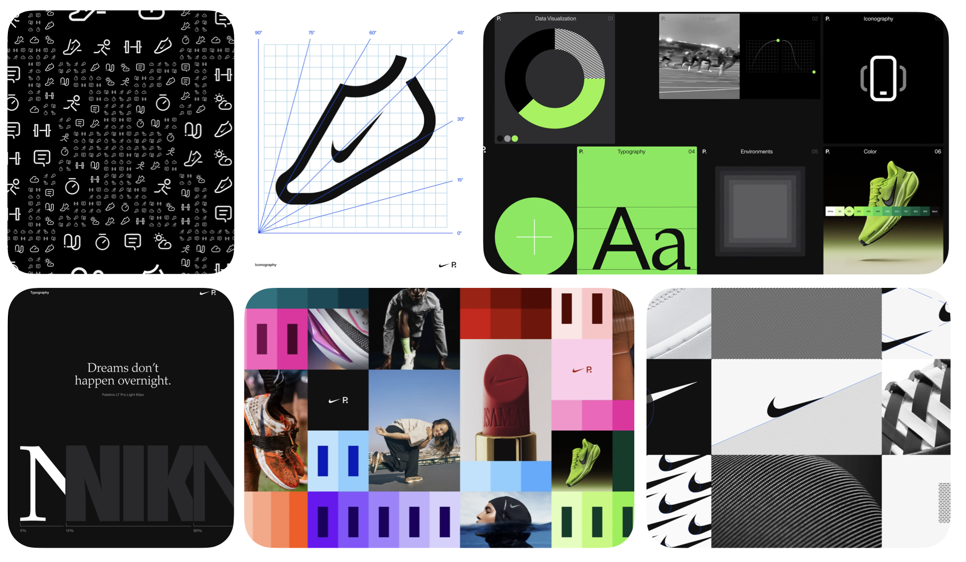
Nike’s Podium system is a global design language built for speed, not show. Tokens, components and modular type unify teams across products, platforms and continents without flattening Nike’s athlete-first edge. It’s a mature, scalable system that strengthens internal clarity and external cohesion all at once.
What Founders and Brand Owners Can Learn
Brands often chase creativity before building the infrastructure to support it. Nike flips the order.
Design isn’t decoration. It’s operational acceleration. This system proves that when organizations align their design foundations, performance compounds everywhere else.
18. Now Now
Saint Urbain
(May 2024)
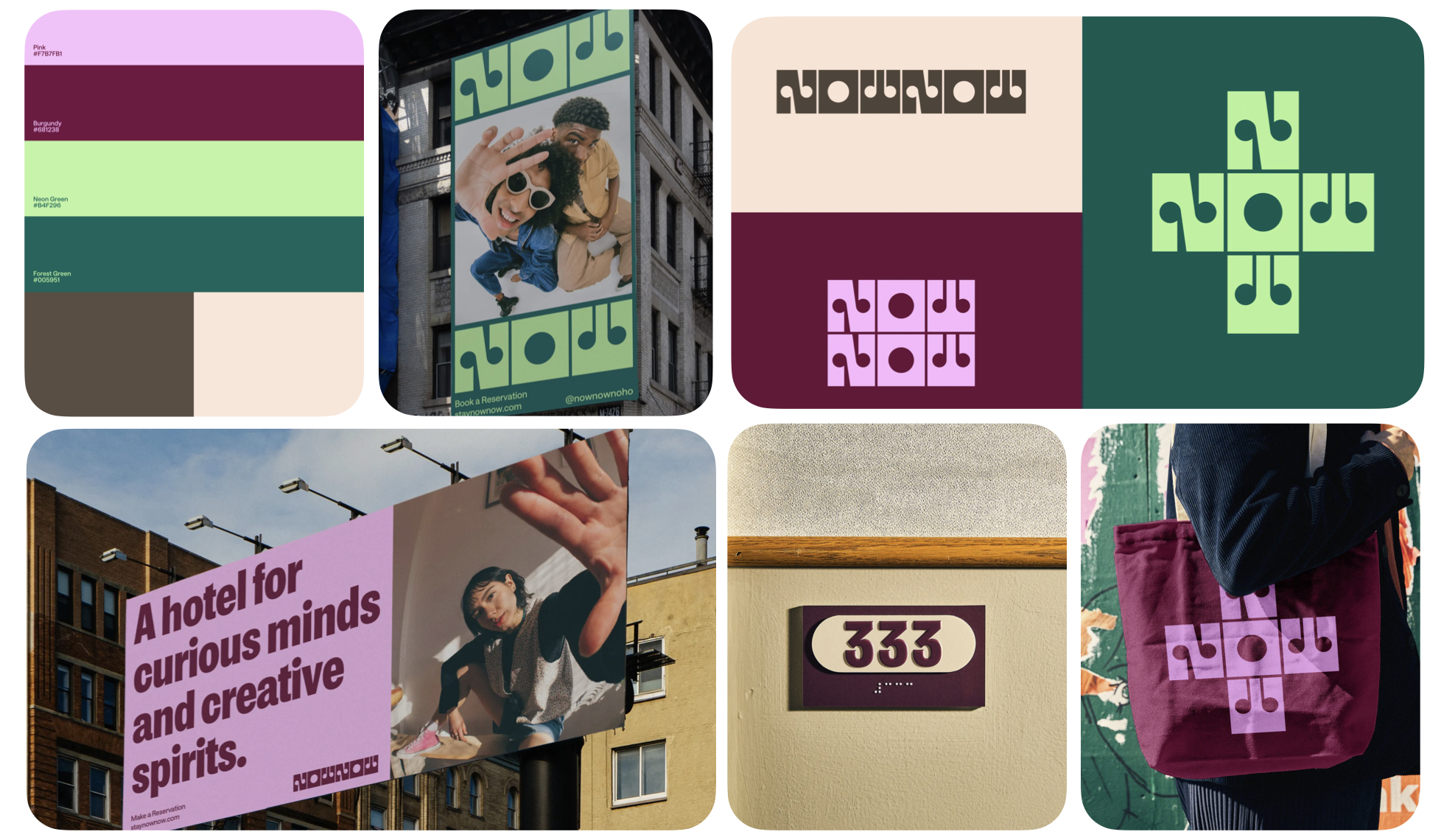
Now Now turns impatience into brand personality. The stacked wordmark, warm tones and punchy, shareable layouts capture a fast, playful energy that stands apart from the overly serious boutique hotel space. It’s charming, direct and instantly memorable, a brand built for the momentum-driven mindset of modern travelers.
What Founders and Brand Owners Can Learn
Every brand has a truth. Few dare to turn that truth into identity. Now Now builds its entire personality around a human behaviour most brands ignore.
Own the impulse behind your product — not just the product itself. By embracing immediacy, the brand becomes refreshingly distinctive in a category addicted to slow, poetic storytelling.
19. PepsiCo
PepsiCo Design + Innovation
(October 2025)
PepsiCo shifts from a soda-led identity to a human-centered masterbrand. The smiling “P,” organic forms and earthy-bright palette reflect a portfolio that spans food, drinks and purpose-driven innovation. It feels optimistic, friendly and culturally present, a strong move for a company aiming to unify 500+ brands under one promise.
What Founders and Brand Owners Can Learn
Portfolio brands often struggle to feel human. PepsiCo solves this through simplicity and emotional clarity.
When you unify the story at the top, everything beneath it becomes easier to believe. The rebrand signals a shift from corporate distance to people-first connection, one that strengthens both perception and purpose.

20. Royal Albert Hall
Brandpie + In-house
Released: October 2025
Royal Albert Hall’s refresh introduces a curved architectural icon and typographic system rooted in Victorian heritage. A disciplined red palette and refined layouts restore hierarchy and clarity to a venue with enormous cultural weight. It feels grand yet modern, giving performances the space to shine rather than competing with them.
What Founders and Brand Owners Can Learn
Legacy brands often struggle to evolve without diluting their aura. Royal Albert Hall solves this through respect and restraint.
Elevate the experience, not the ego of the brand. By framing performances instead of overshadowing them, the identity strengthens what people come for, the magic inside those walls.

21. Sigma
Stockholm Design Lab
(February 2025)
Sigma’s rebrand finally brings clarity to a complex global tech ecosystem. By elevating the ∑ symbol and reinforcing it with a rational grid and clear typographic system, the identity pulls scattered sub-brands into one disciplined whole. It stays technical without being opaque, giving the company a stronger, more comprehensible presence.
What Founders and Brand Owners Can Learn
Complexity doesn’t need more personality, it needs more order. Sigma shows how structure can act as a strategic amplifier.
Make the logic visible and the trust will follow. By simplifying how the brand communicates its breadth, Sigma makes its value easier to understand and far easier to choose.

22. Target up&up
Collins
(February 2025)
Target’s up&up moves from “budget alternative” to confident, category-smart value brand. Collins introduces a flexible system where each product family has its own visual world, all held together by the consistent arrowmark and packaging structure. Real-world testing improves usability while reduced plastic supports a stronger sustainability story.
What Founders and Brand Owners Can Learn
Value branding works when it feels considered, not cheap.
Affordable shouldn’t look apologetic, it should look intentional. up&up proves that design can elevate perception across thousands of SKUs, making clarity and quality feel accessible to everyone.

23. Twelve Labs
Pentagram
(May 2024)
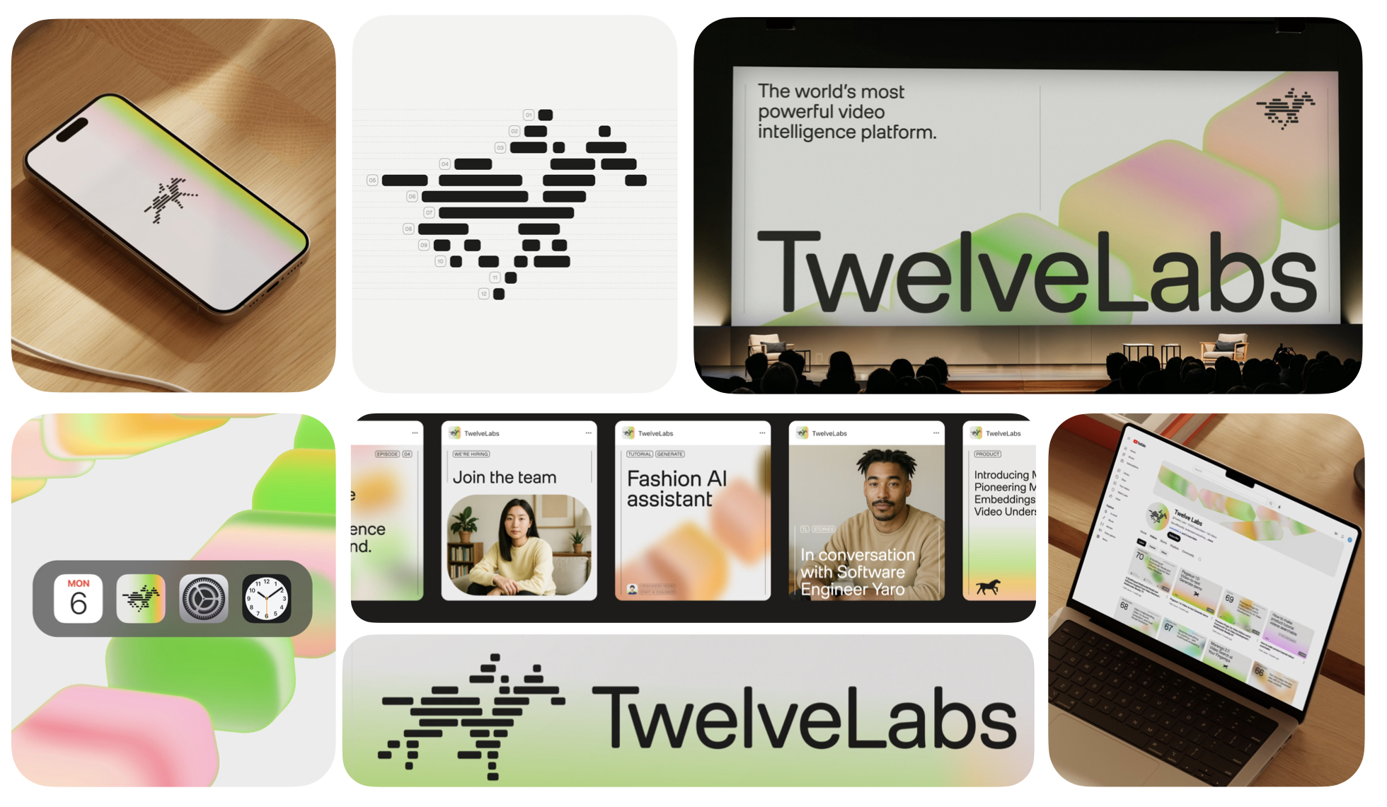
Twelve Labs visualizes intelligence through motion. Pentagram’s thread diagrams map how AI reads sight, sound, text and movement, while the galloping horse nods to the roots of motion study. The system feels foundational yet expressive, translating invisible AI processes into something people can intuitively grasp.
What Founders and Brand Owners Can Learn
AI brands often lean too heavily on abstraction or futurism. Twelve Labs wins by making complexity beautifully human.
If people can’t see how your tech works, show them how it feels. The identity brings dimensional clarity to an industry full of ambiguity — a powerful strategic advantage.
24. Uniqode
Koto
(April 2025)
Uniqode uses stitching as its guiding metaphor, tying physical and digital worlds together through a crafted, tactile identity. Cross-stitch motifs, custom type and motion logic transform a QR-focused platform into something surprisingly human, approachable and grounded. It feels built, not coded.
What Founders and Brand Owners Can Learn
B2B tech often hides behind abstraction. Uniqode does the opposite, it leans into craft.
Humanizing the invisible is one of the strongest moves a tech brand can make. By giving texture to digital infrastructure, the brand achieves memorability in a category known for sameness.

25. Viceroy Hotels & Resorts
Made Thought
(December 2024)
Viceroy reframes luxury as immersion rather than excess. Made Thought’s fluid monogram, tactile textures and poetic editorial layouts invite guests to slow down and connect with the essence of each property. It feels intimate, cultured and quietly daring, a refreshing contrast to cookie-cutter “global luxury” aesthetics.
What Founders and Brand Owners Can Learn
Luxury grows more powerful when it’s personal, not performative.
Don’t design for status. Design for presence. Viceroy’s shift proves that true distinction comes from sensorial depth and point of view, not ornamentation.

26. Walmart
JKR
(January 2025)
Walmart’s evolution is subtle but meaningful. The refined wordmark, richer True Blue and sharper Spark create a more confident, omni-channel identity that flexes across clinics, delivery vans, signage and digital environments. It’s a refresh built on precision — small changes that add up to a major impact.
What Founders and Brand Owners Can Learn
Not every rebrand needs theatrics. Walmart proves the power of incremental clarity.
Small refinements, repeated consistently, can shift the perception of an entire brand. By modernizing without overhauling, Walmart strengthens familiarity while improving usability — a smart balance for any high-frequency brand.

After a year of tracking, analysing and reshaping this long list into something meaningful, one thing is clear: great rebrands don’t happen by chance. They happen when brands choose clarity over noise, courage over comfort and discipline over decoration. The 25 brands on this list didn’t simply change how they look they sharpened how they compete, how they behave and how they show up in culture.
If you’re a founder or brand owner, this list is more than inspiration. It’s a roadmap. Every one of these rebrands, in its own way, proves that design is not cosmetic. It’s strategic. It shapes perception, guides behaviour and directly influences growth.
The brands that win are the ones willing to rethink themselves before the market forces them to. The ones that evolve with intention, not panic. The ones that choose to stand out, not blend in.
This year’s Top 25 shows what happens when brands commit to that level of clarity and ambition. Now it’s your turn to decide which of them truly defined 2025.
Now that you’ve explored the full list, the insights, the lessons and the moves that shaped this year, it’s time to cast your vote.
Share your Top 3 on my LinkedIn carousel and help decide the Final Top 10 Rebrands of 2025. Your vote shapes the final ranking. Your voice decides what rises to the top.
Voting link:
Let’s finish this together. Let’s crown the brands that truly punched this year.
→ Download as PDF
If this article made you think about your own brand, that's worth a conversation.
Book a Free Vision Clarity Session →

Connecting
brands to
customers
for 19 years
2006 - 2025
N —
Nineteen years ago, we started with one mission: build brands that break through.
I —
It wasn’t about being the biggest, but the boldest
N —
Names, narratives, and identities, crafted to punch above their weight.
E —
Every project, a new challenge. Every brand, a new fight worth showing up for.
T —
Through shifts and time zones, we stayed true with clarity, speed, impact.
E —
Egos aside, it’s always been about the work—and the people brave enough to back it.
E —
Every client, partner, and teammate—past and present—shaped this journey.
N —
Now, 19 years in. This isn’t a milestone. It’s a launchpad.


