Colour — The language of emotion
Colour isn’t decoration — it’s direction. It shapes how people feel about your brand before they read a single word.
When chosen strategically, colour builds trust, recall, and emotional connection. When chosen by taste, it creates confusion and inconsistency.
A great colour system starts with clarity, not preference. Your role is to define the feeling you want your brand to evoke; your designer’s role is to engineer that feeling across every platform and touchpoint.
Get it right, and your colour stops being visual. It becomes identity — the emotion people remember you by.
When most founders think about branding, they picture a logo. When designers think about branding, they think in colour. Colour is one of the first things people notice about your brand. Before anyone reads your tagline or hears your pitch, they feel something.
That feeling — warm or cool, energetic or calm, trustworthy or playful — is the subconscious power of colour at work. But colour isn’t decoration. It’s strategy in disguise. A smart colour system tells your story without words. It shapes perception, builds emotion, and anchors your identity in memory.
Download our Free Color Chart guide here:
Get it right, and people recognize you from a single hue — like Tiffany blue, Coca-Cola red, or Cadbury purple.
Colour in branding is never just aesthetic. It’s meaning, emotion, and memory, wrapped in light.
Why colour matters
1. Colour speaks before words.
Before logic, there’s feeling. Colour bypasses reason and triggers emotion. That’s why red feels urgent, blue feels safe, and green feels natural. When used strategically, colour becomes emotional shorthand, a way to make people feel something before you say anything. Founders who choose colour well aren’t just designing visuals. They’re designing trust.
2. Colour builds recognition.
Research shows that colour can increase brand recognition by up to 80%.
Think of Coca-Cola’s red, IKEA’s blue and yellow, or Starbucks’ green. Even without logos, those colours instantly cue emotion and identity. Recognition begins with consistency, but it’s sustained through feeling.
3. Colour creates trust through repetition.
Consistency breeds familiarity. Familiarity breeds trust. When your brand colours appear the same across every touchpoint — packaging, website, signage, ads — your audience begins to rely on them. Repetition isn’t dull; it’s how trust is built.
4. Colour helps you stand out.
In crowded markets, sameness is fatal. If every fintech is blue and every wellness brand is green, colour becomes your first chance to break the pattern. Spotify’s lime green stands out in a sea of red. Airbnb’s coral pink feels human next to corporate navy.
Distinctiveness isn’t about using a colour no one’s ever used. It’s about owning a feeling no one else has claimed.
The psychology of colour
Colour isn’t just visual — it’s psychological. Each hue carries an emotional message and strategic function.
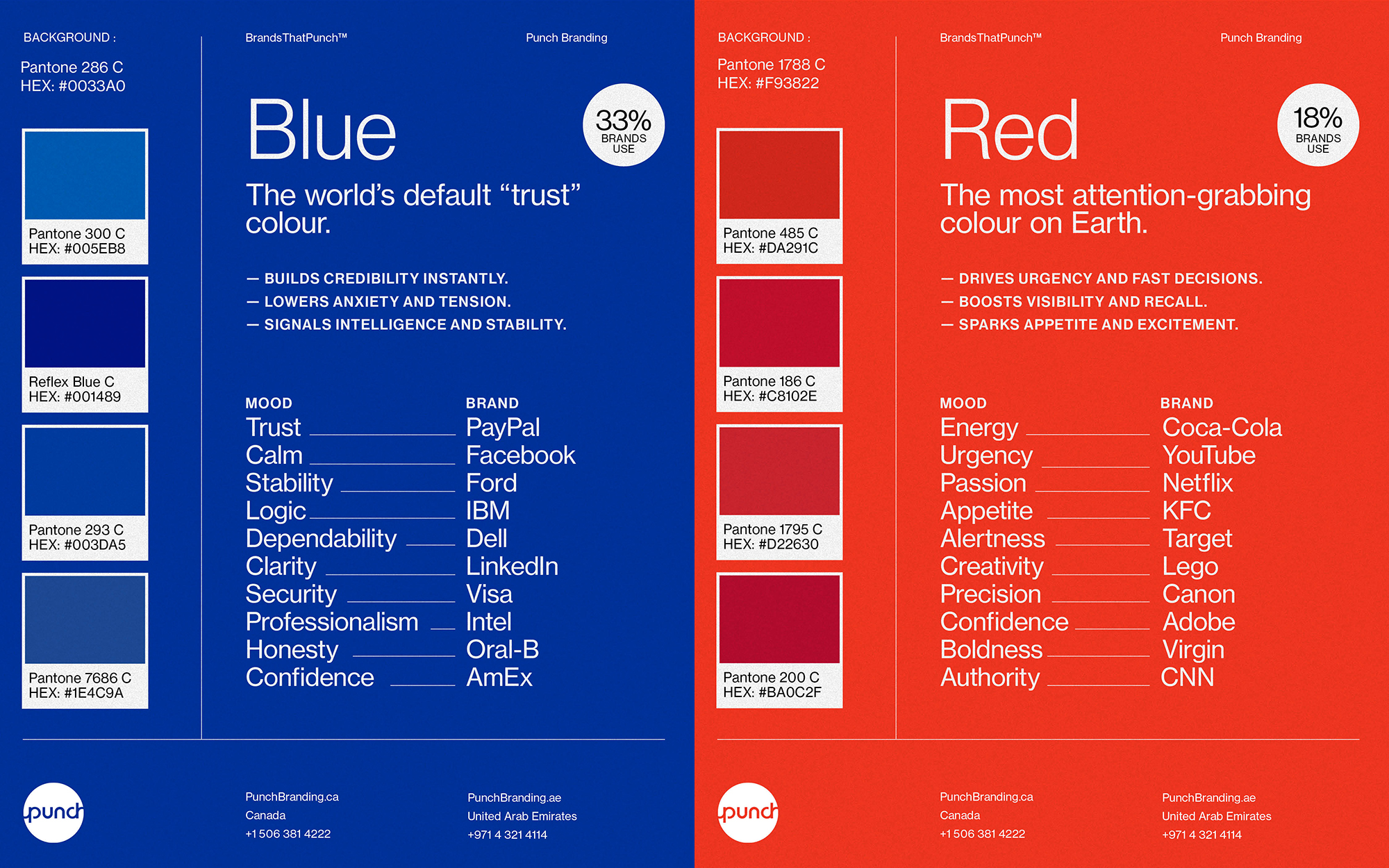
Red signals energy and appetite — used by Coca-Cola, Netflix, YouTube.
Blue conveys trust and intelligence — IBM, Dell, PayPal.
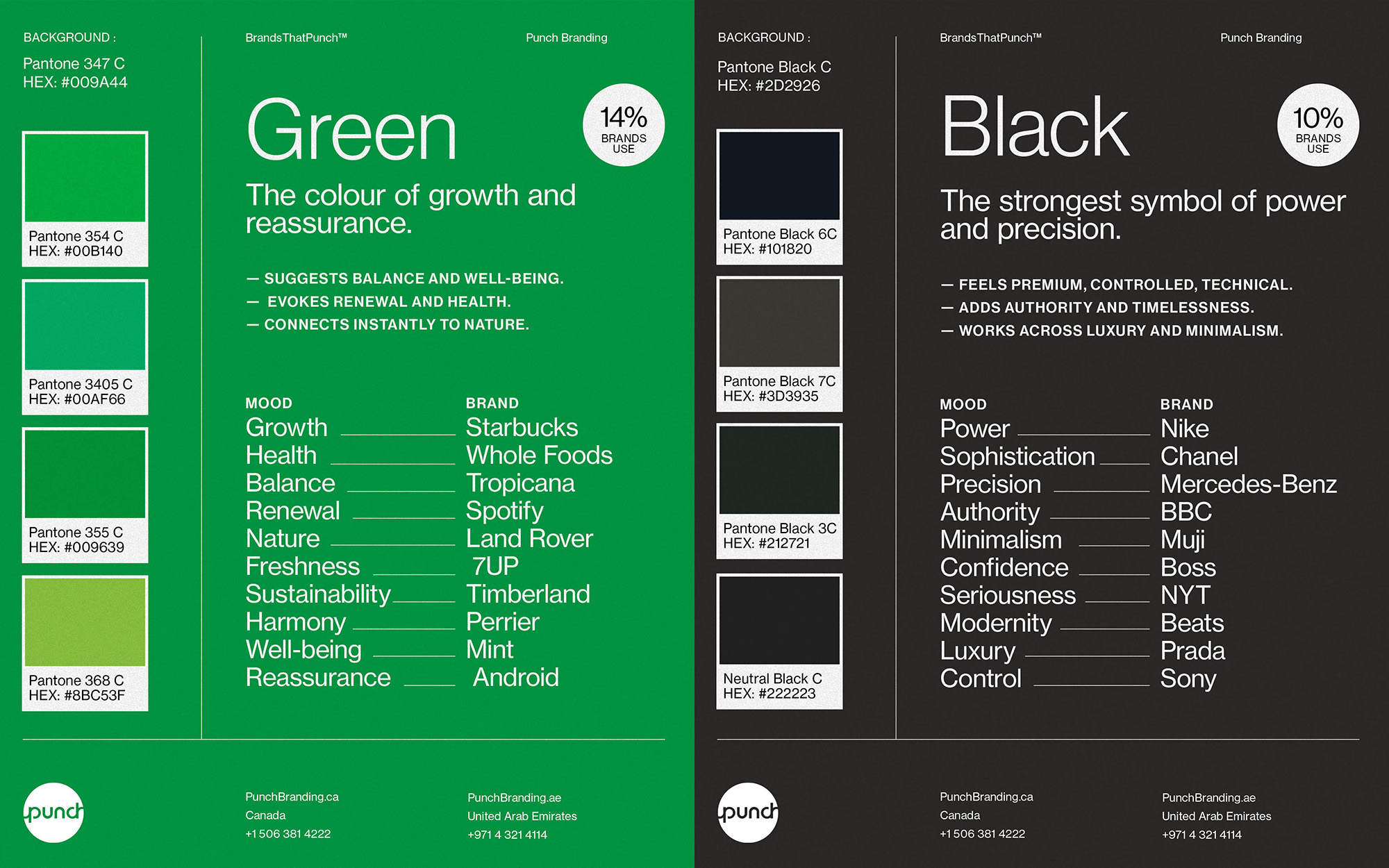
Green represents renewal — Starbucks, Whole Foods, Tropicana.
Yellow radiates optimism — IKEA, McDonald’s, National Geographic.
Orange shows confidence — Fanta, Harley-Davidson, SoundCloud.
Purple expresses creativity and luxury — Cadbury, Hallmark, Twitch.
Black and grey mean power and sophistication — Apple, Chanel, Nike.
White and cream evoke purity and simplicity — Muji, Apple, The Ordinary.
Pastels and neutrals suggest calm and accessibility — Glossier, Airbnb, Calm.

But psychology is only part of the story. The real meaning of colour emerges when filtered through your strategy. An Explorer brand might use deep blues and earthy browns to suggest discovery. A Creator might choose vivid contrasts to signal imagination. A Caregiver might lean on soft greens or blues to create calm.
There’s no “right” colour, only one that feels true to who you are.
How a brand palette is built
Building a colour palette isn’t about taste. It’s a process — a mix of science, psychology, and brand insight. Your job as a founder isn’t to pick colours. It’s to understand what each one does and why it matters. Here’s what happens behind the scenes when professionals create your palette.

It begins with strategy, not shade.
Before a designer opens a colour wheel, they clarify your story, your audience, purpose, and position. The question isn’t “What looks good?” It’s “What should people feel when they see us?”
Colour becomes a translation of your values and archetype. It’s discovered through clarity, not preference.
Your hero colour becomes your anchor.
Every brand has one dominant hue, the one that triggers instant recall. It aligns with your purpose, stands out in your market, and performs across media. Once chosen, it’s documented precisely in HEX, RGB, CMYK, and Pantone. That way, your colour behaves the same everywhere — on screen, in print, and in real life.
Supporting tones build flexibility.
No colour stands alone. Designers create systems, secondary hues for depth, neutrals for balance, and accents for emphasis. Used sparingly, these tones add structure and rhythm. Too many colours create noise. A refined palette creates harmony.

Testing ensures performance.
A colour that shines online might fail in print. Designers test each hue for legibility, contrast, and lighting — refining until it performs everywhere. They balance the science of light with the art of emotion. Colour shouldn’t just look right; it should behave right.
Rules keep it consistent.
Once approved, designers set proportions, often the 60–30–10 ratio: a foundation colour, supporting tones, and subtle accents. This keeps your visuals balanced and recognizable. Small deviations, repeated often, dilute your equity.
Documentation protects your investment.
A professional brand doesn’t leave colour to interpretation. Every hue, its purpose, and its values are recorded in your Brand Guidelines or Minimum Viable Brand document. That’s how your colours stay yours, across designers, agencies, and time.

A note of caution.
Online tools like Coolors or Khroma are great for inspiration, but they can’t replace strategy. Colour only works when tied to meaning. Your role is to define the feeling you want your audience to experience. Your designer’s role is to make that feeling visible and consistent.
Common mistakes to avoid
Most colour issues happen after launch, not during design. They’re small slips that compound over time. Choosing by personal taste instead of customer emotion. Adding too many colours, creating confusion. Ignoring accessibility, making content hard to read. Chasing trends that age quickly. Letting shades drift slightly between uses. Copying competitors instead of standing apart.
Each mistake chips away at trust. Good branding is repetition, not reinvention.
Colour and culture
Colour isn’t universal. Its meaning changes across markets. Red brings luck in China but signals danger in the West. White symbolizes purity in some cultures and mourning in others. Green can suggest growth or jealousy, depending on context. If you operate globally, test your palette for cultural resonance. Ask whether the feeling you intend is the one being received.
Colour as Strategy
When strategy leads, colour becomes meaning. When taste leads, it becomes noise. Great brands don’t pick colours — they build them. Each hue reflects essence, emotion, and consistency. When those align, colour stops being visual and becomes identity.
That’s when people don’t just see your brand. They feel it.
Finding Your Brand’s True Colours
Every brand has a story. Colour is how you make people feel it instantly. Look at your logo, your website, your packaging — and ask: Does this colour still feel like us? Does it tell the same story our strategy does? Would people recognize us from hue alone?
If you can say yes, you’ve built more than a palette. You’ve built meaning.
At BrandsThatPunch™, we help founders craft strategic, scalable colour systems as part of the Minimum Viable Brand (MVB), so your visual identity performs as beautifully as it looks. Because colour isn’t an accessory to branding. It’s the emotion that powers it.


Connecting
brands to
customers
for 19 years
2006 - 2025
N —
Nineteen years ago, we started with one mission: build brands that break through.
I —
It wasn’t about being the biggest, but the boldest
N —
Names, narratives, and identities, crafted to punch above their weight.
E —
Every project, a new challenge. Every brand, a new fight worth showing up for.
T —
Through shifts and time zones, we stayed true with clarity, speed, impact.
E —
Egos aside, it’s always been about the work—and the people brave enough to back it.
E —
Every client, partner, and teammate—past and present—shaped this journey.
N —
Now, 19 years in. This isn’t a milestone. It’s a launchpad.
